


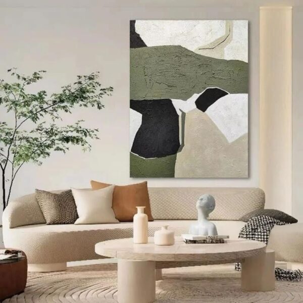
Wall art has the power to set the tone of a room. Framed prints, canvas paintings, and gallery walls transform the atmosphere of a space. A well-planned layout brings atmosphere, creates a focal point, and ties the décor together.
This guide shares simple steps and creative tips to help you arrange wall art with confidence. And when you’re ready to shop for stunning pieces, LA Furniture Store offers a beautiful collection of wall art and paintings along with modern furniture to complete your home’s look.
- Pick the Right Wall and Purpose
Every wonderful display starts with a focal wall that immediately draws attention. Generally, this is the wall that you see first after walking into the room or the wall behind the main piece of furniture.
The wall is the stage for your artwork. You need a space that offers a good viewing distance. Avoid putting a huge piece in a narrow hallway where no one can appreciate it. A long, flat wall is ideal because it gives the art room to breathe. Always select a wall that allows the art to feel connected to the rest of the room, not just stuck on a random spot.
Once you have decided on the wall, establish the function of that wall. Do you want the wall to be used dramatically to display a single statement piece of art, or should it tell a story through a full gallery of art? This purpose dictates the art size and arrangement.
2. Select a Focal Piece or Collection

Now that you have decided on the wall, it’s time to determine its anchor. The anchor point could either be a single biggest piece or the largest one among a grouping within the gallery. It dictates the color scheme, style, and size of the arrangement. You always build out from the center or from the largest item.
When you plan to create a gallery wall with a collection of pieces, they need to feel like they belong together. Establish a clear unifying factor. This is what makes a collection look purposeful instead of cluttered.
Use matching frames, such as all-white or all-natural wood. Alternatively, unify the art by subject matter, such as all black-and-white photos or all oil paintings. That common element gives the whole collection a polished, put-together appearance.
3. Measure and Scale to Furniture

Wall art looks best when it feels connected to the furniture below it. A piece that hangs too high or too low looks lost and disconnected. A common professional rule for scaling is to have the art span roughly two-thirds (about 67%) of the width of the furniture below. For a 90-inch sofa, the art or the entire grouping should measure about 60 inches wide.
Next, you need to consider the height. Interior designers hang artwork with its center or the entire group about 57 inches from the floor. This measurement aligns with the average eye level of most users, which is a comfortable viewpoint for most observers.
When hanging over furniture, leave a gap of approximately 6 to 8 inches between the bottom lip of the frame and the back top side of the sofa or console table. This small gap connects the art to the furniture while preventing people from hitting their heads.
4. Choose Your Layout Style
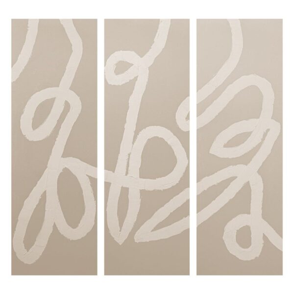
Before you place anything, you need a plan for your layout style. You have two choices. The first is the Grid Layout, which is highly organized and formal in nature. This style uses a painting set of 2 or 3 pieces of the same size, hung in straight, symmetrical rows with equal spacing between them. It creates a very clean, crisp, and modern look that offers visual peace.
The second option is the Salon Style (or organic style), which is much more popular for homes. This casual approach lets you mix and match different sizes, shapes, and frame styles. The salon style focuses on visual balance rather than perfect symmetry. You can arrange pieces in a free-flowing cluster around a central focal point. This method is a natural evolution of your collection, adding a lot of personality to a room.
5. Plan the Arrangement on the Floor (or with Templates)
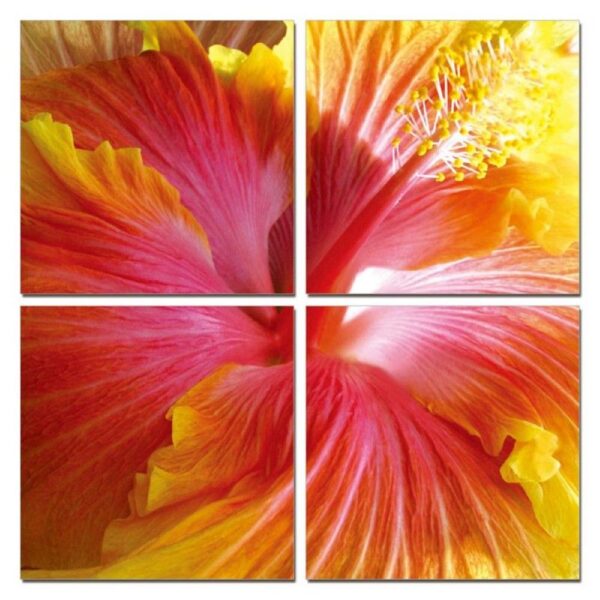
Never start nailing into the wall without a dry run. The most important step for getting the spacing right is planning your arrangement on the floor. Lay down a sheet or blanket. Then, place all your artwork on the floor and move it around. You instantly see how the pieces relate to each other and easily adjust the spacing and balance before lifting them.
A powerful tool professionals use involves paper templates. Cut pieces of wrapping paper or newspaper to the exact size and shape of each frame. Use painter’s tape to attach these paper cutouts to the wall in your planned arrangement. This allows you to stand back, check the scale, and confirm the height with zero commitment. You even mark where the nail needs to go right on the paper, making the actual hanging process much faster and completely foolproof.
6. Set Consistent Spacing

After planning the exact arrangement on the floor or with templates, set the space between the art pieces. This gap is known as negative space. Consistent spacing makes the entire grouping look intentional and professional. Designers typically recommend leaving a gap of 2 to 3 inches between frames in a gallery wall. A tight gap keeps the collection feeling like one single unit rather than a bunch of random items.
Maintain uniform spacing throughout the entire arrangement, both vertically and horizontally. For example, if you set 2 inches between the pieces going across, you use 2 inches between the pieces stacked up and down. Larger artwork sometimes needs a slightly wider gap, maybe 4 inches. Remember, the goal is to make all pieces appear connected, so avoid large spaces that visually separate them.
7. Hang at Eye Level
Now you are ready to put the art on the wall, and the most critical rule here is to position it at eye level. As we discussed earlier, the center of the entire artwork, or the center of the grouping, is located 57 inches above the floor. This height ensures every piece is easy and comfortable to view. People look directly at the art instead of having to look up or down.
You measure 57 inches up from the floor and mark that spot. Then you measure the distance from the wire on the back of the frame to the top edge of the frame. Subtract that measurement from 57 inches; this gives you the exact location for your nail or hook. Always install with proper hardware rated for the artwork’s weight. Use anchors on very heavy items to prevent falling.
8. Mix and Match Frames Thoughtfully
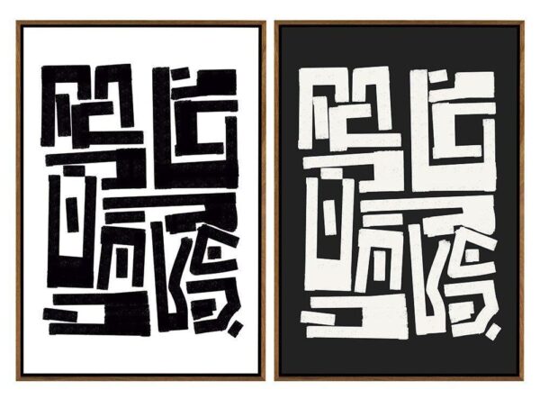
Beautiful gallery walls require a variety of things that combine cohesiveness and interest. Frames are the most likely ones to do the trick. Mix colors, materials, and textures for a unique look. A big chunky gold frame with a delicate metal black frame and a rough-textured timber frame is the perfect combination. Different combinations provide depth and interest to the whole collection.
For balance, choose a dominant frame style. For instance, you keep 80% of your frames in black, then use one or two frames in wood or silver as an accent. Another technique is to use the same matting color, such as all bright white mats. The common matting provides a consistent border that ties all the varied frames and artwork together perfectly.
9. Add Lighting and Supporting Décor
Art does not live alone on the wall; it needs the right lighting and décor to complete the scene. Proper lighting ensures your artwork is visible and celebrated, even in the dark. You use a small, adjustable picture light that attaches to the top of the frame. Alternatively, you place a floor lamp nearby that aims a spotlight directly at the wall grouping.
Extend the display beyond the frames by adding supporting décor to the furniture below. Placing some sculpture and a vase or a stack of bright-colored books on the console table just underneath the art connects the wall to the floor. The objects, along with the piece of art, make up one whole beautiful vignette.
10. Step Back, Adjust, and Refine

You finally hammered the last nail, but your job is not quite done yet. The final, essential step is to step back and review the entire arrangement from different points in the room. Look at the wall from across the room, from the doorway, and while you sit on the sofa. Your fresh perspective immediately spots any piece that looks slightly crooked or too close to its neighbor.
Make small micro-adjustments. With the help of a level, make sure that everything is straight. Don’t be afraid to nudge a piece or redo a nail hole if something feels off-balance. All these small, time-consuming adjustments ensure that your arrangement looks smooth, well-balanced, and extremely professional.
Where to Find The Best Wall Art That Matches Your Furniture Style
You can find the best wall art that matches your furniture style in many places once you know your style. Begin by exploring online art marketplaces. Websites dedicated to art feature work from thousands of artists, offering a vast variety of styles, colors, and price ranges. Many sites allow you to filter by categories such as abstract, landscape, or minimalist, making it easy to find a piece that complements your modern or rustic furniture. Additionally, shopping online allows you to easily compare sizes and read customer reviews.
Do not forget about local shops and artists. When you purchase artwork from local artists, it tells a personal story about your home. You can be assured that no one else has what you have. For budget-friendly options, go to flea markets and thrift stores. You’ll find beautiful vintage-framed prints and a unique mirror that add character to your space without spending too much.
Finally, think about home décor stores and furniture showrooms. These places group art by common decorating styles, such as farmhouse, mid-century modern, or bohemian. This makes the selection process simple because the wall art is already curated to match the furniture they sell. Remember to always measure your wall space first before you start shopping.
Want something classic yet chic? LA Furniture Store has a wide selection of wall art perfect for modern and contemporary home styles. You find just the piece to finish off your room and work with your sleek new furniture. Check out the collection for some beautiful and well-coordinated home décor.
FAQs About Arranging Wall Art
How do you choose wall art to complement a bedroom set?
You can choose wall art to complement a bedroom set by matching the colors, themes, or materials. For instance, your bedroom set features warm wood tones, and artwork with earthy or neutral colors helps tie the room together. Consider balance too. Oversized art makes a bold statement, while smaller grouped pieces create intimacy.
No, it is not a strict rule for the rug color to coordinate with the wall art. However, when they share tones, textures, or themes, the room feels cohesive. You can match rug accents with colors from your art, use complementary colors, or rely on neutral rugs to ground bold, colorful pieces and avoid visual clutter.
How do you balance color tones when arranging wall art?
You can balance color tones when arranging wall art by repeating key colors across multiple pieces to create harmony. Place bold or dark tones among lighter artworks to avoid heavy clusters. Neutral frames or mats soften vibrant colors, while spacing art evenly allows your eye to move comfortably across the arrangement without imbalance.
What type of wall art works best in small apartments?
The type of wall art that works best in small apartments is oversized statement pieces or cohesive gallery walls with fewer, larger pieces. Smaller, cluttered artwork makes a compact room feel busier. Mirrors, abstract prints, and vertical art are also great choices because they add depth and height, creating an illusion of more space.
How do you avoid overcrowding when hanging multiple pieces?
You can avoid overcrowding when hanging multiple pieces by spacing them consistently, typically 3–6 inches apart. Keep the arrangement within the visual boundaries of nearby furniture to prevent it from spilling across the wall. Group art by theme, size, and color palette for unity, and leave negative space around the arrangement to allow the art to breathe.
How do you arrange wall art in a hallway?
You can arrange wall art in a hallway by creating a linear gallery wall with evenly spaced frames at eye level. Stick to smaller or mid-sized pieces since hallways are narrow and benefit from proportionate art. Repetition of similar frame styles or color schemes helps unify the look, while lighting, such as wall sconces, enhances visibility and impact.
Should wall art always be centered and aligned with the furniture?
No, wall art does not always need to be centered and aligned with the furniture. While centering above furniture creates symmetry, offset or asymmetrical arrangements add character. Keep the art connected visually by maintaining a 6–8 inch gap above the furniture. As long as the scale fits and the spacing is balanced, you can experiment with creative alignment.
What wall art size fits best above a dining table?
The wall art size that fits best above a dining table is typically two-thirds the width of the table, creating balance without overwhelming the space. Leave 4 to 12 inches between the bottom of the art and the dining table top. For flexibility, group multiple smaller pieces to form a unified gallery-style arrangement above the dining area.
Is it okay to mix photography and paintings on the same wall?
Yes, it is okay to mix photography and paintings on the same wall. Choose matching frames, consistent spacing, and similar palettes to bring the works together. Combine modern photographs with abstract paintings and landscapes. Balance the display to prevent one art form from dominating and make the wall more visually interesting.
How much space should be left between wall art and the ceiling?
The space that should be left between wall art and the ceiling depends on the ceiling height and the size of the art. However, a good general rule of thumb is to find the center of the art piece around eye level (about 57–60 inches from the floor). Install art a bit higher in the case of tall ceilings to avoid an overly sinking look. Install artwork slightly lower when you have lower ceilings to improve proportion.
